
Three Essentials for your Small Business Website
A website will always be an excellent tool for your business. It can allow your customers to find out more about your product or service, it can act as a point of contact for customers to get in touch with you, it can provide additional and helpful information for potential clients and customers who are considering working or shopping with you. In short, it is a priceless investment for your business (I know, as a web designer I would say that!) but you’re website is not much more than a shell with the basic bits of information you are really not getting your money's worth.
Maybe I shouldn’t use the word basic. A website can be a fairly simple thing, not every business will require a bells and whistles website, particularly when starting out. What is important though, is that the information that does appear on the website is always serving a purpose. It should always be working for you, as part of your team, to build your relationship with your potential customers.
There are many ways this can be done. The top level of this is the visuals - images, colours, branding - as well as the style of language you use on the site (see my article on Writing for your Website). Deeper than that though is the type of information you are sharing, it should be helpful for your customer, relate to your product or service, move them along the journey towards buying from you.
Related: My Top 10 Website Must Haves for a successful website
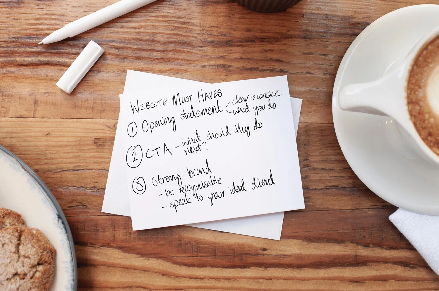
In this post I specifically want to speak about the homepage of your website, which will encompass what I’ve touched on so far. In my opinion, there are three key things every homepage shouldn’t be without, and to skip over them is to do yourself a disservice and is not making the most out of having a website at all.
So let’s dive in!
Your opening statement
This should be a clear message that explains who you are, what you do and who you do it for. Typically it will take the form of a bold statement at the top of the page that is the first thing a visitor to your website will read. It should be around 8-10 words long, but the clearer and simpler the better. This can always be paired with a sub-heading that gives a little bit more information but you by no means want more than a couple of sentences here. It should be to the point and leave no doubt about what it is that you do. Examples of this could be ‘Squarespace website design for home bakeries’ or ‘Minimalist Interior Design for Flat Owners’ so they are specific enough in one sentence that a visitor to your website could immediately count themselves in or out of your content. We’re going to look at a couple of examples below that should help you to understand the type of information you need to share here.
Don’t worry about putting people off here either. Anyone who is put off was never going to buy from you anyway, so you’re just saving you both time!
Call to action or next step
Now that you’ve told your website visitor exactly what you’re about and what they can expect from you, it’s important to direct them where to go next. For most websites there is one primary aim, that one thing you want someone reading your site to do. This might be to sign up to your mailing list, to read your blog, to visit your shop, to schedule a consultation, to view a class timetable...the list is endless. This top-of-the-list-most-important-thing should be the first thing you link to on your homepage. My preference is to use a button, or a large clickable graphic, so that it really stands out and is hard to miss.
Now of course there will be multiple things that you want a visitor to your website to do, but you can deal with those further down your homepage and in your navigation menu. Remember these are my ‘top 3’ homepage must haves, not the only things your website needs ;).
If you’re struggling to narrow this down to just one because you have two or three very separate offerings for customers to take, you can deal with this by creating three side by side links with simple key words about each, so that it’s clear which path the user needs to take to get what they need from you.
A strong brand
This is the most ‘flowery’ of the three but just as important. The fact of the matter is, that if the overall look/feeling/vibe of your businesses website isn’t reflected in the visuals of your site, you won’t be attracting your ideal customer. Or, honestly it should happen the other way around. Your website should appeal to the needs and tastes of the ideal customer you are trying to attract. That way, when they arrive at your website it will just feel right for them. The colours will match the feeling of your service or product, the language you are using throughout the pages, and particularly that opening statement and call to action, sound like language they would use themself. This is why it’s really important to work with a professional designer when you are able to, so that you can have a cohesive brand across your entire business, not just your website and/or logo.
Now that we’ve gone over the three things every successful small business website needs, let’s have a look at some examples!
Examples

Trulery
Trulery offers curated vintage clothing alongside fashion psychology services.
My clients main focus was the vintage shop, so that was out lead statement and call to action.
To reflect the vintage style, we used a warm palette of light and dark browns. Pairing this with a bold, modern font helped to reflect that the items were curated and up to date.

Abacus Accountancy
The opening statement from Abacus speaks directly to their busy business owner clients, with our sub-heading clearly stating what they do and where they are based.
This is backed up with an immediate ‘Contact’ button.
The visuals are corporate (to reflect their clients) but friendly and welcoming, to reflect their style.

Proud PR
The USP of Proud PR is their ‘people focused’ approach. Minus any jargon and industry fluff. We’ve paired a headline that states just that with a sub-heading sharing what they do - ‘PR with integrity’.
This CTA takes the user straight to their services page.
The design of the site is fun and personable, which is the core ethos of Proud PR. Subtle animations keep this going throughout the site (check it out here!)
I hope breaking down those examples helped to illustrate how important these key elements are to your business website. If you’d like to chat about your existing website, or are looking to get your business online for the first time, you can find out more about my services at the link below, or get in touch here.