Website Design Tips for Wellness Coaches: How to Stand Out Online
We all know by now how important it is to have an online presence for any business and this is also true for a coaching business. Whether you are in the wellness space, a business coach or teaching a skill your website can do so much to help your business in both a practical (helping with client management, leads) and marketing (resources, blog, building credibility) way.
Your website is the perfect place to deepen the connection between you and your potential coaching clients which may start on Instagram, TikTok or LinkedIn but will ultimately end at your website.
A list of tips is always a great starting point but to help you best understand and visualise what I mean, I’ll share some examples of coaching websites that I have worked on below to help explain.
Clear brand and style
To make sure your enquiries are coming from the right people your website should pull in your ideal clients and repel the people who are not right for you or your coaching service. Don’t be afraid of the word ‘repel’ either! I know it sounds strong but there is no point in spending time on an enquiry that turns out to be a bad fit for both of you.
The first way this attraction happens is through the visuals. This is what people will see and make a judgement on within the first few seconds of landing on your website, so it’s key that your colours, fonts and images resonate with your audience.
If your coaching style is calm and serene, using bold fonts and bright neons would feel at odds with this and confuse your audience.
If you are a bold personality with a direct approach, pastels and script fonts probably wouldn’t give the right impression.
This also extends to the copy and language you use on the site. It should reflect your personality and the style of coaching that you will offer. This not only attracts the types of clients that will love working with you, but it avoids any shocks when people meet you and the experience is very different from how it seemed on your website.
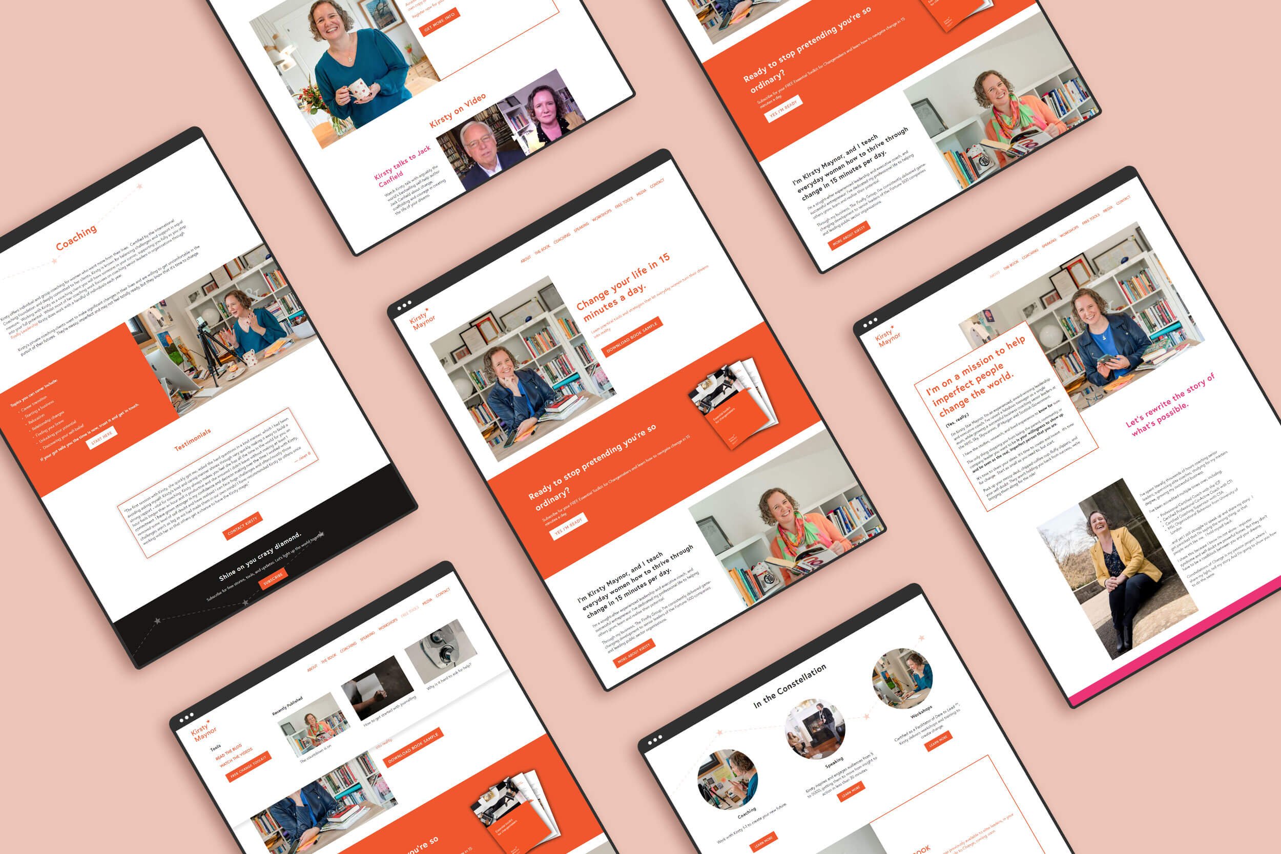
Kirsty Maynor is a business coach who has very clear branding through her visual and language. Visit Site >
Homepage essentials
You can learn about my favourite homepage essentials here, but in short you want:
A clear opening statement that explains what type of coaching you offer and who it’s for
Follow this up with a call to action that will allow users to take the next step to working with you – whether that’s booking a call or reading about your packages
A photo of you! You want to make a personal connection with your audience early on so they know who they will be working with
Outline the services you offer and allow an easy path for people to learn more
Testimonials or short case studies to give examples or what it’s like to work with you.
For more tips around planning your homepage and structuring your website, check out the blog posts below:
Three essentials for your website homepage
Simple SEO for your small business website
Share your personality and skills on about page
Coaching is such a personal service as you are working closely with your clients one-to-one. As such, it’s even more important to establish a personal connection with your audience throughout your online content. On your website, this should be done across the entire site but where you can really open up is your about page.
Use this space to tell the story of how you became a coach. You don’t need to tell people every step of your life but pull out the bits that your audience will relate to and that tie in with your coaching services.
You can also showcase any coaching qualifications you have gained too.
Personally, I also like to complement this with some ‘fun facts’ or more random personal information such as your favourite show, your pets name or your cookie of choice.
Read more: Keeping your business branding consistent
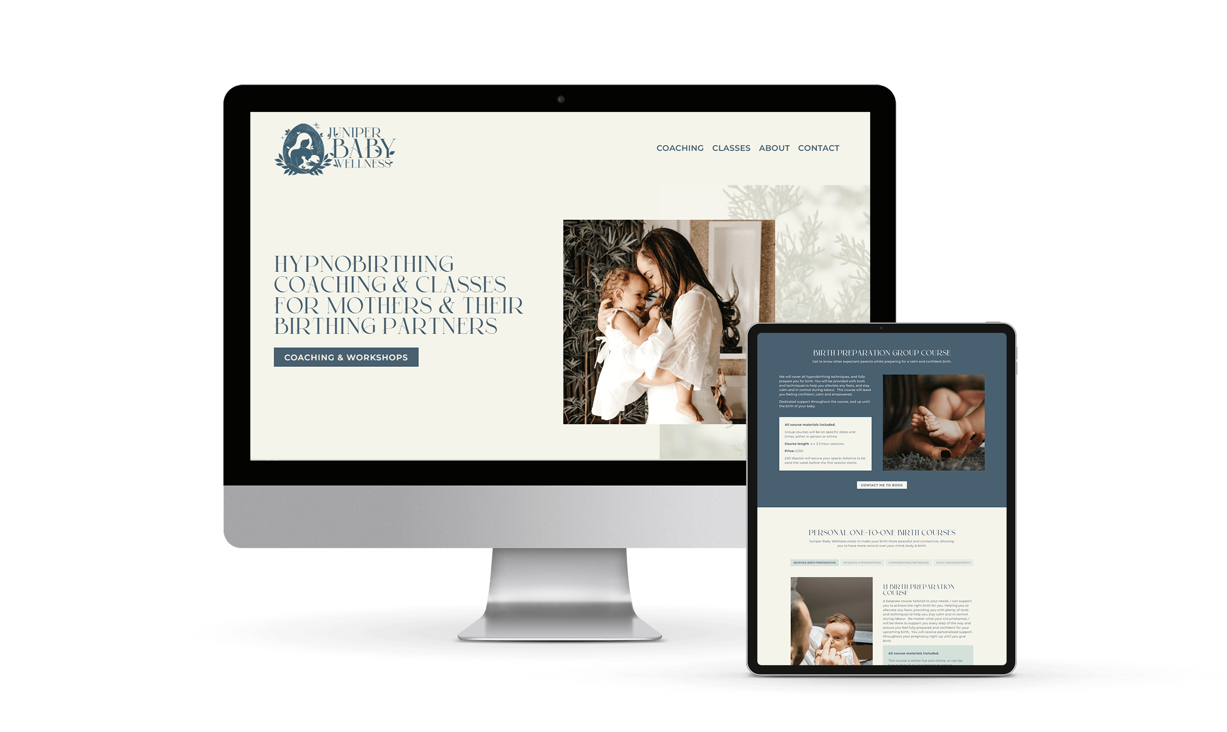
Juniper Baby Wellness is a simple one page site where we relied mainly on stock photos. You can see how we were thoughful about selecting images that were still on brand and followed the tone of the site and service. Visit Site >
Images
This follows the brand point above. Your images should go hand in hand with the other visuals on your website to create a holistic impression of your style to the visitor. The best way to achieve this is through a set of custom brand images, but I understand that’s not always achievable, particularly if you are new in business. Take your time to select a set of stock images that are unique and inline with your brand.
Stock photo sites:
Unsplash
Pexels
Shutterstock
Don’t forget to include images of you! This is especially important as a coach because your clients will be working directly with you, often on quite personal matters, so building a rapport and connection will help clients to feel comfortable working with you.
Read more: Using images on your website
Use past client stories to build trust and authority
Featuring client testimonials will allow potential coaching clients to better see themselves working with you. Some key points to cover in case studies are:
What the clients situation was before working with you
What the experience was like from prep to completion
How they feel or have changed as a result
Having a full case study page on your site is a great resource, not only for potential clients, but also for yourself when you come to create social media content in the future. You can pull quotes or short paragraphs from the full case study to feature in posts or stories.
Whether or not you are featuring a full page, including shorter case studies or client testimonials throughout the other pages of your site is one of my favourite sections to add to a page to always remind potential clients of the impact of your work.
Walking Coach uses the power of walking in nature to support personal and leadership growth. Showcasing words from past clients will help to convey how this type of coaching can help the client. Visit Site >
Use a built-in appointment system
Take advantage of the technology that is available to help make your life easier! Using a booking system for clients to book enquiry calls or coaching appointments directly into your calendar will safe so much back and forth in your inbox.
If you are using Squarespace for your website, their built in Scheduling tool Acuity is brilliant for both free enquiry calls and paid coaching services. You can create packages of multiple sessions, take full or part payments and sync everything up with a video call platform. It can also be used for in-person appointments and will send automatic reminders by email or text to your clients.
Other tools for this include Calendy.
Take payments online (if needed)
To keep your admin time down, you can also take payments for your coaching services online. There are a variety of options for how you would achieve this from a scheduling tool, as above, using an online shop or a simple Stripe/PayPal button.
If you don’t want potential clients to book and pay without having an enquiry call first, you can create hidden pages/shops to sell these and only share the link after you have established a relationship.
The downside here is that there are transaction fees associated with using online payment platforms, so it’s worth weighing up the cost options to decide what’s right for you.
Member area for general client resources
If you offer resources to the clients that you work with, rather than sending these by email to each new client, you could create a page on your website to house everything. This page could be password protected or require clients to create a log in to keep things even more secure.
This could also be expanded to create a membership for clients who are not ready to work with you one-to-one but would benefit from your knowledge and resources. It’s also a nice way of creating some ‘passive’ income for your business and building a community.
Read more: Introduction to Squarespace courses
Build a community with a blog and newsletter
And on the topic of community, this is something that can help to build your audience and keep a stream of clients headed your way. There are loads of different email marketing platforms out there but if your audience is small and you are looking for something simple, and you are using Squarespace for your website, I recommend checking out there email platform. It doesn’t have lots of bells and whistles but it will allow you to get started quick with building an email list.
Adding a ‘lead magnet’ that complements your specific coaching services is a great way to encourage people to sign up.
Read more: Introduction to Squarespace Campaigns
Next steps
I hope this list has given you some food for though to either refresh an existing website, or as a starting point if you are about to begin your website journey. If you want any help with either, you can get in touch with me to arrange a chat.


